UX DESIGN
Cardia, a concept health & fitness application
Cardia was a side project of mine, as I wanted to teach myself Facebook’s Oragami Studio program.
Timeline: August 2019 Role: Designer Team: Personal Project

PROCESS
I wanted to explore a new wire-framing program, and decided to mock-up a health & fitness concept app.
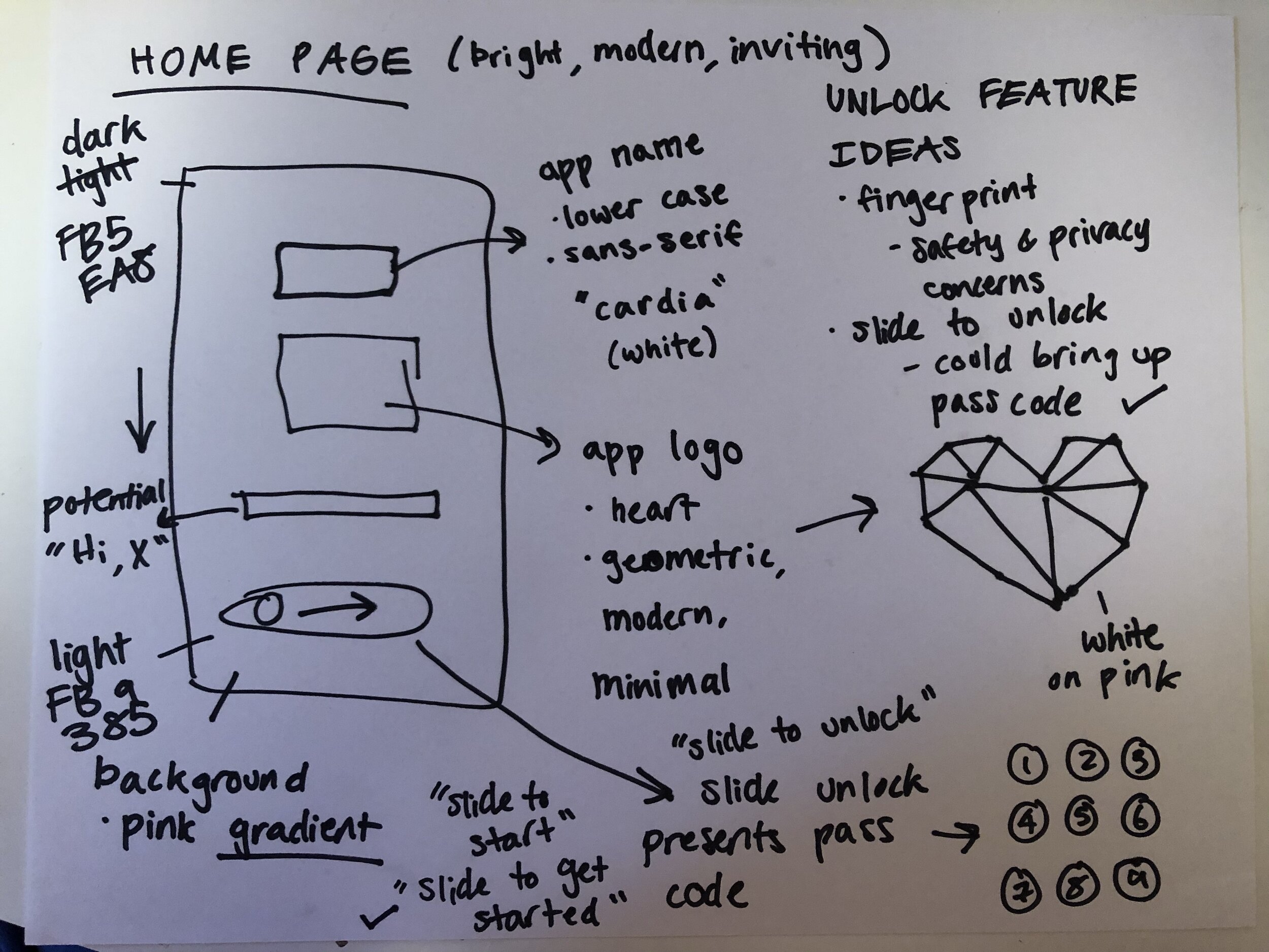
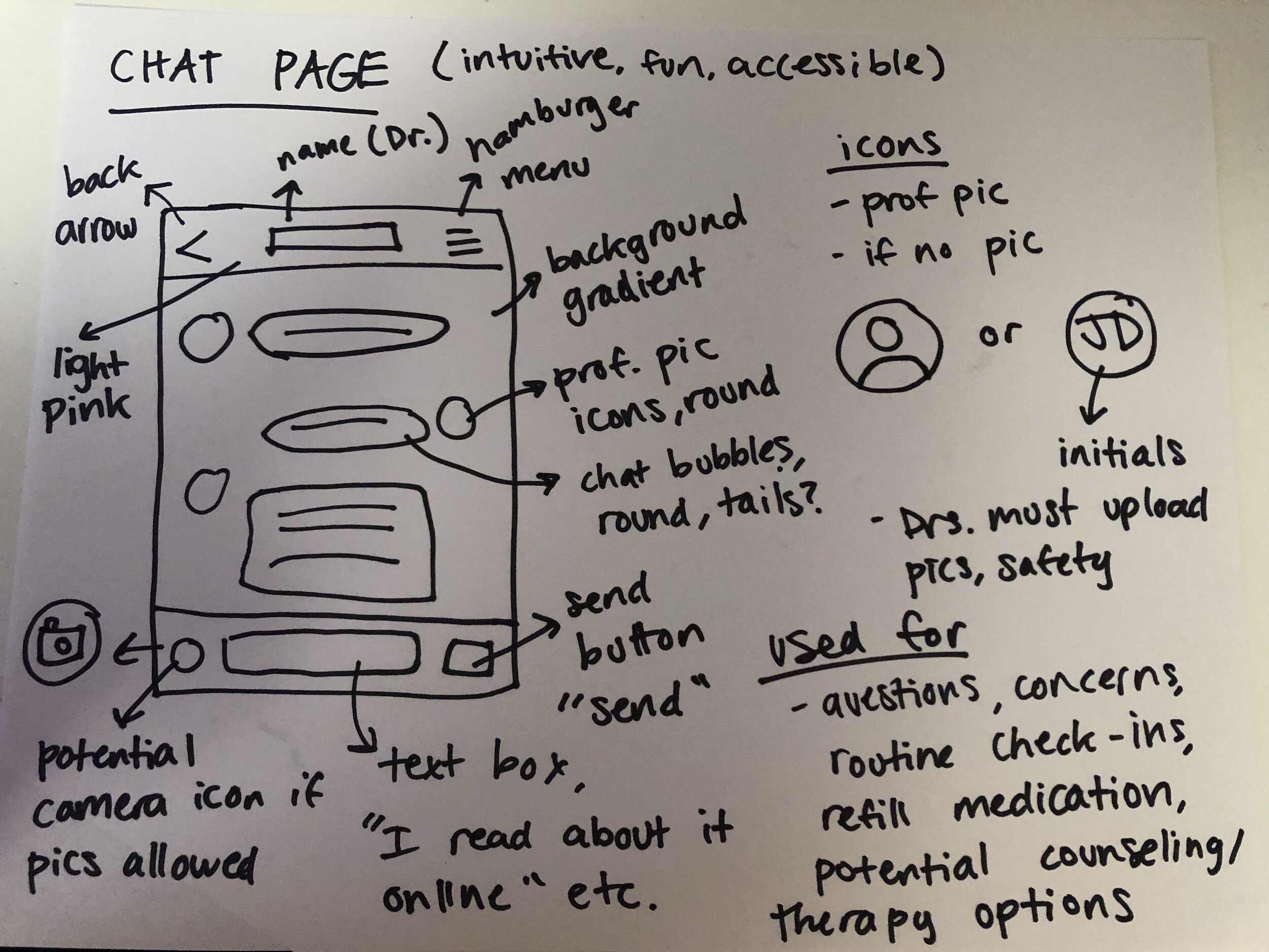
I started by outlining what I wanted the frames to look like.


PRODUCT
I used bright, playful colors to bring an active, energetic feel to the brand. I chose pink tones because they can be both soft and lively, and read well on a screen.
For this same reason I also used rounded corners, call-to-action phrases/buttons, minimalist layouts and highly legible fonts.


